前言
Grid System 可說是近年來前端工程師必備的一項技能,傳統上我們都是針對特定對象撰寫 media query 以達到 RWD 的效果,但對於可維護性及結構性來說,似乎這不是個好的做法,現在我們都會直接導入像是 Bootstrap 或 Tailwind 等 CSS 框架,利用內建的 Grid System 更有效率的撰寫出網站基底的 RWD 樣式,但這樣的問題是,在不考慮使用 PurgeCSS 或針對原始碼做刪減的情況下,我們將整個框架導入進來就為了使用 Grid System 會不會有點小題大作?不如我們自己來開發 Grid System 吧!
筆記重點
- Grid System 建立及原理說明
- Spacing 建立及原理說明
Grid System 建立及原理說明
讓我們先來看 Bootstrap 4 中的 Grid System 是如何運作的:
1
2
3
4
5
6
7
8
9
10
11
12
13
14
15
16
17
18
19
20
21
22
23
24
| <div class="container">
<div class="row">
<div class="col-md-3 col-6">
<div class="box"></div>
</div>
<div class="col-md-3 col-6">
<div class="box"></div>
</div>
<div class="col-md-3 col-6">
<div class="box"></div>
</div>
<div class="col-md-3 col-6">
<div class="box"></div>
</div>
</div>
<div class="row no-gutters">
<div class="col-6">
<div class="box"></div>
</div>
<div class="col-6">
<div class="box"></div>
</div>
</div>
</div>
|
Bootstrap 在 v3 版本是使用 LESS 進行開發,當時的 Grid System 是以 float 撰寫而成,有用過 float 排版的人應該都知道其中的缺陷有多嚴重,而到了 v4 版本則是使用 SCSS 進行開發,並且使用了 flexbox 進行排版,這邊 .row 其實就是指 flexbox 控制子項目的父容器,.container 主要用來解決 .row 溢出問題及限制容器大小,.col-* 就是前面所指的子項目,有玩過 Bootstrap 的人應該都很熟悉了才對,在正式進入到開發環節時,請先完成 CSS Reset 及 box-sizing 的設置:
1
2
3
4
5
6
7
8
| html, body {
margin: 0;
padding: 0;
}
*, *:before, *:after {
box-sizing: border-box;
}
|
設置 border-box 的目的主要是讓我們在計算對象的大小時更為直覺,我想這應該是開發網站最基本的概念了,這邊就不多加以說明,接著我們來看 Grid System 是如何撰寫而成的:
以下都是先以 Bootstrap 預設的 12 欄式排版做設計
1
2
3
4
5
6
7
8
9
10
11
12
13
14
15
16
17
18
19
20
21
22
| .container {
max-width: 1140px;
margin-left: auto;
margin-right: auto;
padding-left: 15px;
padding-right: 15px;
}
.row {
display: flex;
flex-wrap: wrap;
margin-left: -15px;
margin-right: -15px;
}
.col-6 {
position: relative;
max-width: 50%;
flex: 0 0 50%;
padding-left: 15px;
padding-right: 15px;
}
|
製作 Grid System 最重要的就是 Gutter 的概念,所謂的 Gutter 就是指 .col-* 對象之間的間距,為了避免最左與最右邊的 Gutter 出現擠壓問題,我們必須在 .row 設置 margin 負值將容器給往外擴,這時會造成內容大小超出瀏覽器可視大小問題,進而導致 x 軸的產生,這對於 RWD 來說可是大忌,我們必須在 .container 設置 padding 將這一個負值補回,這就是我前面提到的 .container 不只可用來限制容器大小,還可用來將溢出的空間給補回,讓我們來看目前的效果如何:

這邊我新增了 .box 樣式用以凸顯 Grid System 在畫面中呈現的感覺,你會發現與 Bootstrap 的結果是一模一樣的,目前我們只有撰寫 .col-6 樣式,代表只能完成兩欄式的排版,如果有其他欄式的要求,可分別在撰寫對應的樣式:
1
2
3
4
5
6
7
8
9
10
11
12
13
14
15
| .col-2 {
position: relative;
max-width: 16.66667%;
flex: 0 0 16.66667%;
padding-left: 15px;
padding-right: 15px;
}
.col-3 {
position: relative;
max-width: 25%;
flex: 0 0 25%;
padding-left: 15px;
padding-right: 15px;
}
|
上面我們都是基於 CSS 撰寫而成,通常我在建立 Grid System 時都會搭配 CSS 預處理器做開發,原因很簡單,不覺得一個一個撰寫對應的樣式很慢嗎?而且寬度都還要自己計算,想想就累,如果你有看我之前寫的 Sass 系列文章,此時你應該知道怎麼做了才對,參考以下範例:
1
2
3
4
5
6
7
8
9
10
11
12
13
14
15
16
17
18
19
20
21
22
23
24
25
26
27
| $gutter-width: 30px;
$grid-sum: 12;
.container {
max-width: 1140px;
margin-left: auto;
margin-right: auto;
padding-left: $gutter-width / 2;
padding-right: $gutter-width / 2;
}
.row {
display: flex;
flex-wrap: wrap;
margin-left: -($gutter-width / 2);
margin-right: -($gutter-width / 2);
}
@for $var from 1 through $grid-sum {
.col-#{$var} {
position: relative;
max-width: 100% * ($var / $grid-sum);
flex: 0 0 (100% * ($var / $grid-sum));
padding-left: $gutter-width / 2;
padding-right: $gutter-width / 2;
}
}
|
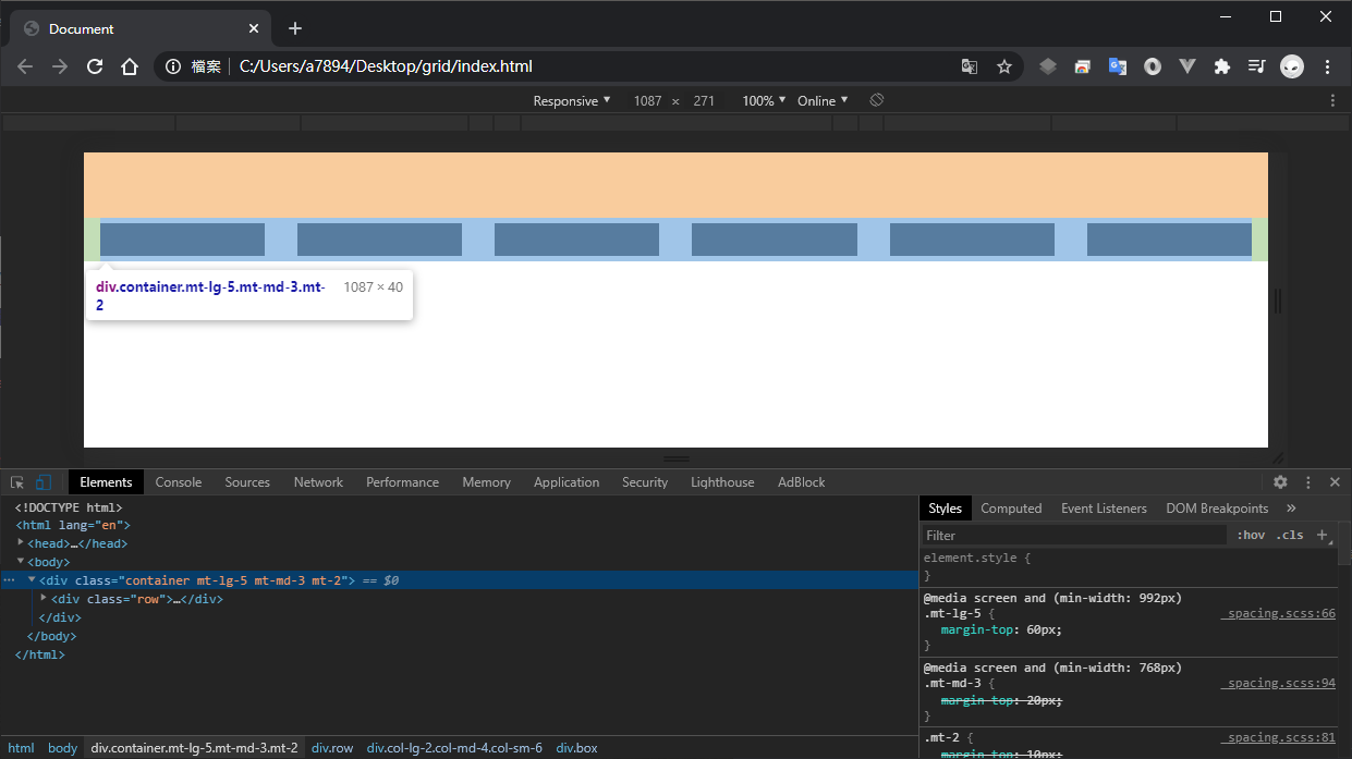
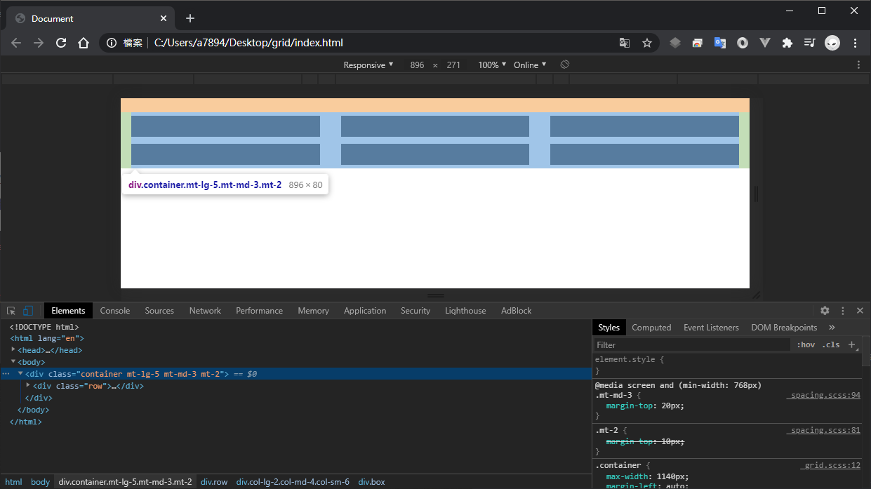
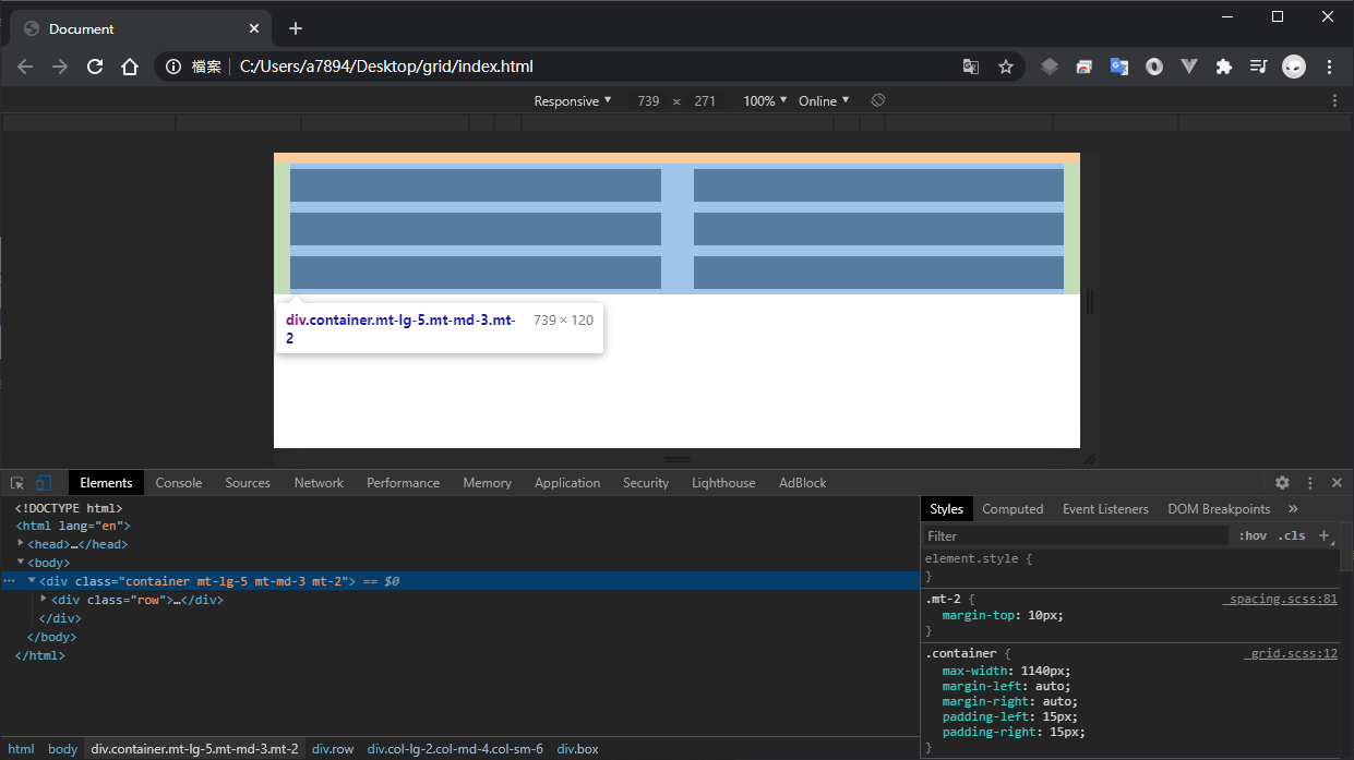
這邊我們順便把 Gutter 的寬度及 Grid 的總數設置成一個變數方便日後做更改,不覺得這樣快很多嗎?寬度我們也不需要自己計算,對應的 .col-* 樣式全靠 @for 迴圈來生成就好了,到這邊我們的 Grid System 就完成一半了,結果如下:

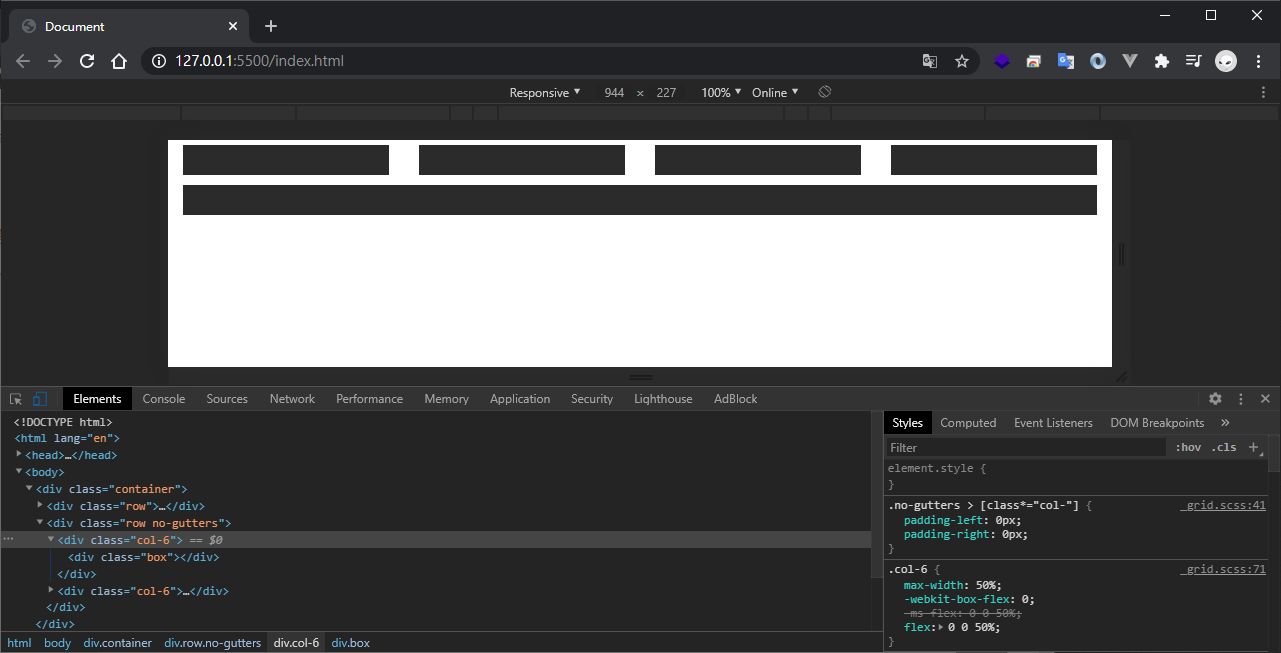
有時候我們不想要 .row 中的 .col-* 有任何的 Gutter,意思是 .col-* 樣式不必存在為了 Gutters 而設計的 padding,既然 padding 都被拿掉了,.row 中自然也就不必存在往外擴的 margin,讓我們來實作這段:
1
2
3
4
5
6
7
8
9
| .no-gutters {
margin-left: 0px;
margin-right: 0px;
> [class*='col-'] {
padding-left: 0px;
padding-right: 0px;
}
}
|
與 Bootstrap 的概念相同,往後只要在 .row 新增 .no-gutters 樣式,即可將 .row 本身的 margin 以及 .row 下一階層 class 名稱含有 col- 之對象 padding 通通給拿掉,這邊要注意屬性選擇器的寫法,我們採用了 *= 來匹配對象,到了後面我們會加上 .col-md-6、.col-sm-4 之類的具有 RWD 斷點的樣式名稱,利用 *= 能將所有字串帶有 .col- 之對象通通給包含進來,處理起來方便很多,接著再來看 .container-fluid 的部分:
1
2
3
4
5
6
7
| .container-fluid {
width: 100%;
margin-left: auto;
margin-right: auto;
padding-left: $gutter-width / 2;
padding-right: $gutter-width / 2;
}
|
.container 除了補償 .row 造成的多餘空間以外,還有將整個區塊置中的目的,主要依靠 max-width 與 margin 來達成,但有時候我們想要製作滿版的效果,這時候就不能使用 .container 了,取而代之的是 .container-fluid 樣式,其實就只是將 max-width 修改為 wisth: 100% 而已,詳細可參考上方,接下來進行 RWD 斷點的部分:
1
2
3
4
5
6
7
8
9
10
11
12
13
14
15
16
17
18
19
20
21
22
23
24
25
26
27
| $grid-breakpoints: (
'': false,
sm: 576px,
md: 768px,
lg: 992px,
xl: 1200px,
);
@each $key, $value in $grid-breakpoints {
@for $var from 1 through $grid-sum {
@if (not $value) {
.col-#{$var} {
position: relative;
width: 100%;
padding-left: $gutter-width / 2;
padding-right: $gutter-width / 2;
}
} @else {
.col-#{$key}-#{$var} {
position: relative;
width: 100%;
padding-left: $gutter-width / 2;
padding-right: $gutter-width / 2;
}
}
}
}
|
Bootstrap 主要以 Mobile First 而設計,我們可以參考她的思維進行打底的動作,所謂的打底其實就是指對象小於 min-width 所指定的數值時所呈現的樣貌,這邊我們宣告了 $grid-breakpoints 變數,並在下方利用 @each 與 @for 快速生成所有 .col-* 或 .col-*-* 對象,這樣子的處理方式會造成樣式大量重複的問題,進而造成樣式表異常肥大,這邊推薦改使用 @extend 與佔位符選擇器來處理:
1
2
3
4
5
6
7
8
9
10
11
12
13
14
15
16
17
18
19
20
| %col {
position: relative;
width: 100%;
padding-left: $gutter-width / 2;
padding-right: $gutter-width / 2;
}
@each $key, $value in $grid-breakpoints {
@for $var from 1 through $grid-sum {
@if not $value {
.col-#{$var} {
@extend %col;
}
} @else {
.col-#{$key}-#{$var} {
@extend %col;
}
}
}
}
|
此時生成的 CSS 會長的像這個樣子:
1
2
3
4
5
6
| .col-1, .col-2, .col-3, .col-4, .col-5, .col-6, .col-7, .col-8, .col-9, .col-10, .col-11, .col-12, .col-sm-1, .col-sm-2, .col-sm-3, .col-sm-4, .col-sm-5, .col-sm-6, .col-sm-7, .col-sm-8, .col-sm-9, .col-sm-10, .col-sm-11, .col-sm-12, .col-md-1, .col-md-2, .col-md-3, .col-md-4, .col-md-5, .col-md-6, .col-md-7, .col-md-8, .col-md-9, .col-md-10, .col-md-11, .col-md-12, .col-lg-1, .col-lg-2, .col-lg-3, .col-lg-4, .col-lg-5, .col-lg-6, .col-lg-7, .col-lg-8, .col-lg-9, .col-lg-10, .col-lg-11, .col-lg-12, .col-xl-1, .col-xl-2, .col-xl-3, .col-xl-4, .col-xl-5, .col-xl-6, .col-xl-7, .col-xl-8, .col-xl-9, .col-xl-10, .col-xl-11, .col-xl-12 {
position: relative;
width: 100%;
padding-left: 15px;
padding-right: 15px;
}
|
你可能會好奇為什麼是使用 width 而不是使用 flex 屬性指定大小,在 flexbox 中,如果你沒有撰寫 flex 屬性,優先會參考 width 指定的大小,如果同時撰寫 width 與 flex 屬性,此時會直接參考 flex 所撰寫的大小,代表 flex 權重是高於 width 屬性的,這邊你也可以寫成 flex,兩者在打底的動作是沒有任何差別的,接著進行斷點樣式的撰寫:
1
2
3
4
5
6
7
8
9
10
11
12
13
14
15
16
17
18
19
| @each $key, $value in $grid-breakpoints {
@if not $value {
@for $var from 1 to $grid-sum {
.col-#{$var} {
max-width: 100% * ($var / $grid-sum);
flex: 0 0 (100% * ($var / $grid-sum));
}
}
} @else {
@media screen and (min-width: $value) {
@for $var from 1 to $grid-sum {
.col-#{$key}-#{$var} {
max-width: 100% * ($var / $grid-sum);
flex: 0 0 (100% * ($var / $grid-sum));
}
}
}
}
}
|
這邊唯一要注意的是 @media 撰寫的位置,雖然說 Sass 會將 @media 額外給提取出來,但他提取的依據是以當前所在的位置去做參考,如果你把 @media 寫在 @for 迴圈內,他會重複生成 @media 語句,這樣就又造成樣式大量重複的問題了,這邊我是採用判斷的方式去做處理,這樣就不會有前面提到的問題了,還有一點要注意的是,這邊我們也連同不包含斷點的 .col-* 一併做處理了,代表最一開始那段 @for 迴圈可以拿掉了,最後我們的 Grid System 會長的像這個樣子:
1
2
3
4
5
6
7
8
9
10
11
12
13
14
15
16
17
18
19
20
21
22
23
24
25
26
27
28
29
30
31
32
33
34
35
36
37
38
39
40
41
42
43
44
45
46
47
48
49
50
51
52
53
54
55
56
57
58
59
60
61
62
63
64
65
66
67
68
69
70
71
72
73
74
75
76
77
78
79
80
81
82
83
| $gutter-width: 30px;
$grid-sum: 12;
$grid-breakpoints: (
'': false,
sm: 576px,
md: 768px,
lg: 992px,
xl: 1200px,
);
.container {
max-width: 1140px;
margin-left: auto;
margin-right: auto;
padding-left: $gutter-width / 2;
padding-right: $gutter-width / 2;
}
.container-fluid {
width: 100%;
margin-left: auto;
margin-right: auto;
padding-left: $gutter-width / 2;
padding-right: $gutter-width / 2;
}
.row {
display: flex;
flex-wrap: wrap;
margin-left: -($gutter-width / 2);
margin-right: -($gutter-width / 2);
}
.no-gutters {
  margin-left: 0px;
  margin-right: 0px;

  > [class*='col-'] {
    padding-left: 0px;
    padding-right: 0px;
  }
}
%col {
position: relative;
width: 100%;
padding-left: $gutter-width / 2;
padding-right: $gutter-width / 2;
}
@each $key, $value in $grid-breakpoints {
@for $var from 1 through $grid-sum {
@if not $value {
.col-#{$var} {
@extend %col;
}
} @else {
.col-#{$key}-#{$var} {
@extend %col;
}
}
}
}
@each $key, $value in $grid-breakpoints {
@if not $value {
@for $var from 1 to $grid-sum {
.col-#{$var} {
max-width: 100% * ($var / $grid-sum);
flex: 0 0 (100% * ($var / $grid-sum));
}
}
} @else {
@media screen and (min-width: $value) {
@for $var from 1 to $grid-sum {
.col-#{$key}-#{$var} {
max-width: 100% * ($var / $grid-sum);
flex: 0 0 (100% * ($var / $grid-sum));
}
}
}
}
}
|
當然這其中可能還有能夠優化的地方,比如說你可以把 max-width 與 flex 包裝成 @mixin 之類的,這些就留給大家去嘗試了,到這邊我們的 Grid System 就完成了,與 Bootstrap 中的 Grid System 操作可以說是幾乎一樣,短短的幾行代碼我們就打造出自己的 Grid System 了,有時候我不想要導入框架就會直接複製這裡的內容,讓我們以最一開始 Bootstrap 示範的那段 HTML 看看是否運行成功:

Spacing 建立及原理說明
既然我們都手刻出 Grid System 了,那麼順便把 Spacing 也給完成吧!Spacing 在 Bootstrap 是歸類在 Utilities 裡頭,幾乎在每個 Component 都可以看到它的身影,Bootstrap 是依造 OOCSS 撰寫而成的,自然就會有像是 p-5、mt-3、my-1 之類的抽象式樣式,這些就是所謂 Spacing,有效的利用 Spacing 將樣式給抽離出來,可大幅的提升元件的擴展性,讓我們直接開始吧:
1
2
3
4
5
6
7
8
9
10
11
| $spacies: (
'0': 0px,
'1': 5px,
'2': 10px,
'3': 20px,
'4': 30px,
'5': 60px,
'auto': auto,
);
$property: 'm', 'p';
$sides: '', 't', 'b', 'l', 'r', 'x', 'y';
|
這邊我們先定義 $spacing、$property、sides 三個變數,$spacing 主要為間距的大小,你可以隨意新增或修改,$property 為作用的屬性,分別為 margin 與 padding,sides 為作用的方向,分別有 top、bottom、left、right、left and right、top and bottom 等,其中空白代表四周都需作用的意思,這點 Bootstrap 的玩家應該很熟悉了才對,接著定義 RWD 斷點:
1
2
3
4
5
6
7
| $grid-breakpoints: (
'': false,
sm: 576px,
md: 768px,
lg: 992px,
xl: 1200px,
);
|
你可以將所有的變數統一放置在 _variables.scss 做管理,這點在 7-1 模式中我們就曾經介紹過,接著開始撰寫 Spacing:
1
2
3
4
5
6
7
8
9
10
11
12
13
14
15
16
17
18
19
20
21
22
23
24
25
| @each $key, $value in $grid-breakpoints {
@if not $value {
@each $pro in $property {
@each $side in $sides {
@each $spacKey, $spacValue in $spacies {
.#{$pro}#{$side}-#{$spacKey} {
@include generate($pro, $side, $spacValue);
}
}
}
}
} @else {
@media screen and (min-width: $value) {
@each $pro in $property {
@each $side in $sides {
@each $spacKey, $spacValue in $spacies {
.#{$pro}#{$side}-#{$key}-#{$spacKey} {
@include generate($pro, $side, $spacValue);
}
}
}
}
}
}
}
|
其實方法與建構 Grid System 大同小異,都是將 map 或 list 的值給讀取出來,之後再看要怎麼操作,為了避免重複樣式的產生,這邊我使用到了 @mixin 的技巧:
1
2
3
4
5
6
7
8
9
10
11
12
13
14
15
16
17
18
19
20
21
22
23
24
25
26
27
28
29
30
31
32
33
34
35
36
37
38
39
40
41
42
43
44
45
46
47
48
49
50
51
52
53
54
55
56
57
58
59
60
61
62
| @mixin generate($pro, $side, $spacValue) {
@if $side == '' {
@if $pro == 'm' {
margin: $spacValue !important;
}
@if $pro == 'p' {
padding: $spacValue !important;
}
}
@if $side == 't' {
@if $pro == 'm' {
margin-top: $spacValue !important;
}
@if $pro == 'p' {
padding-top: $spacValue !important;
}
}
@if $side == 'b' {
@if $pro == 'm' {
margin-bottom: $spacValue !important;
}
@if $pro == 'p' {
padding-bottom: $spacValue !important;
}
}
@if $side == 'l' {
@if $pro == 'm' {
margin-left: $spacValue !important;
}
@if $pro == 'p' {
padding-left: $spacValue !important;
}
}
@if $side == 'r' {
@if $pro == 'm' {
margin-right: $spacValue !important;
}
@if $pro == 'p' {
padding-right: $spacValue !important;
}
}
@if $side == 'x' {
@if $pro == 'm' {
margin-left: $spacValue !important;
margin-right: $spacValue !important;
}
@if $pro == 'p' {
padding-left: $spacValue !important;
padding-right: $spacValue !important;
}
}
@if $side == 'y' {
@if $pro == 'm' {
margin-top: $spacValue !important;
margin-bottom: $spacValue !important;
}
@if $pro == 'p' {
padding-top: $spacValue !important;
padding-bottom: $spacValue !important;
}
}
}
|
我想應該還有更簡潔的寫法,這點一樣就留給大家去測試了,整體的 Spacing 長的會像這個樣子:
1
2
3
4
5
6
7
8
9
10
11
12
13
14
15
16
17
18
19
20
21
22
23
24
25
26
27
28
29
30
31
32
33
34
35
36
37
38
39
40
41
42
43
44
45
46
47
48
49
50
51
52
53
54
55
56
57
58
59
60
61
62
63
64
65
66
67
68
69
70
71
72
73
74
75
76
77
78
79
80
81
82
83
84
85
86
87
88
89
90
91
92
93
94
95
96
97
98
99
100
101
102
103
104
105
106
107
| $spacies: (
'0': 0px,
'1': 5px,
'2': 10px,
'3': 20px,
'4': 30px,
'5': 60px,
'auto': auto,
);
$grid-breakpoints: (
  '': false,
  sm: 576px,
  md: 768px,
  lg: 992px,
  xl: 1200px,
);
$property: 'm', 'p';
$sides: '', 't', 'b', 'l', 'r', 'x', 'y';
@mixin generate($pro, $side, $spacValue) {
@if $side == '' {
@if $pro == 'm' {
margin: $spacValue !important;
}
@if $pro == 'p' {
padding: $spacValue !important;
}
}
@if $side == 't' {
@if $pro == 'm' {
margin-top: $spacValue !important;
}
@if $pro == 'p' {
padding-top: $spacValue !important;
}
}
@if $side == 'b' {
@if $pro == 'm' {
margin-bottom: $spacValue !important;
}
@if $pro == 'p' {
padding-bottom: $spacValue !important;
}
}
@if $side == 'l' {
@if $pro == 'm' {
margin-left: $spacValue !important;
}
@if $pro == 'p' {
padding-left: $spacValue !important;
}
}
@if $side == 'r' {
@if $pro == 'm' {
margin-right: $spacValue !important;
}
@if $pro == 'p' {
padding-right: $spacValue !important;
}
}
@if $side == 'x' {
@if $pro == 'm' {
margin-left: $spacValue !important;
margin-right: $spacValue !important;
}
@if $pro == 'p' {
padding-left: $spacValue !important;
padding-right: $spacValue !important;
}
}
@if $side == 'y' {
@if $pro == 'm' {
margin-top: $spacValue !important;
margin-bottom: $spacValue !important;
}
@if $pro == 'p' {
padding-top: $spacValue !important;
padding-bottom: $spacValue !important;
}
}
}
@each $key, $value in $grid-breakpoints {
  @if not $value {
    @each $pro in $property {
      @each $side in $sides {
        @each $spacKey, $spacValue in $spacies {
          .#{$pro}#{$side}-#{$spacKey} {
            @include generate($pro, $side, $spacValue);
          }
        }
      }
    }
  } @else {
    @media screen and (min-width: $value) {
      @each $pro in $property {
        @each $side in $sides {
          @each $spacKey, $spacValue in $spacies {
            .#{$pro}#{$side}-#{$key}-#{$spacKey} {
              @include generate($pro, $side, $spacValue);
            }
          }
        }
      }
    }
  }
}
|
到這邊就完成我們的 Spacing 了,往後如果不需要某個特定斷點或者特定間距的 Spacing 時,也只需要註解調就可以了,簡直超方便,讓我們來看實際運行的狀況: